Web AppBuilder Overview
Web AppBuilder allows you to create apps by accessing workflow tabs including Theme , Map, Widget, and Attribute.
Theme
A theme is a template framework representing the look and feel of an app. Content in a theme includes a collection of panels, styles, and layouts, and a set of preconfigured theme widgets. A single app can only use one theme while running.
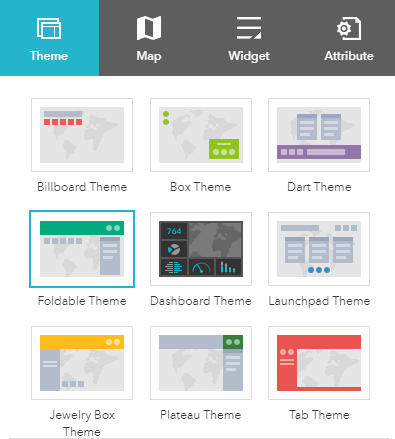
Web AppBuilder for ArcGIS provides out-of-the-box themes. The Theme tab supports the following:
-
Billboard—Designed for the app with simple tasks. It has the most layouts of all the themes and does not display the logo, links, and widget controller. All the widgets in the theme are on-screen widgets.
-
Box—Focuses on the widgets in the widget controller. By default, all on-screen widgets are turned off. There are no placeholders for widgets and no logo or links display. It is designed for the app that requires a clean look on the map.
-
Dart—Widgets in the widget controller display as placeholder widgets. You can have multiple widgets open and move them around. By default, all on-screen widgets are turned off. Similar to the Box theme, there are no placeholders for widgets and no logo or links display.
-
Dashboard—All the widgets in the panel open simultaneously when the app starts. It is designed to visualize widgets and their communication directly. You can modify the predefined layout by adding or removing grids, or resizing the grids in the panel. By default, most on-screen widgets are turned off except the Home, Zoom Slider, and Full Screen widgets. Optionally, you can turn on the Header widget to display the logo, the app name, and links.
-
Foldable—The first theme created by Web AppBuilder, it supports all widget types and can be used for the app with complicated tasks.
-
Jewelry Box—Evolved from the Foldable theme with a focused widget on the left of the app. It is designed for the app with a workflow task.
-
Launchpad—Designed for users who prefer the Apple Mac style. It allows you to open multiple widgets, and move, resize, and minimize them.
-
Plateau—Can be used to create a modern and basic application with flat toolbars and widget containers.
-
Tab—As with the Foldable theme, it supports all widget types and can be used for the app with complicated tasks.
Formatting Themes
Once you have chosen a theme you will have some options to format it:
-
Select a style—The available styles vary depending on the theme selected. Most themes have seven predefined colors from which to choose, except the Launchpad and Dashboard themes. If your organization has defined the shared theme with a header color, it will be the default color when a new app is created. You can also choose your own color by clicking the last color in the color picker.

-
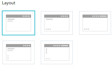
Select a layout—A layout represents a preset placement of user interface items.
-
Only the Dashboard theme allows you to modify and generate your own layout.
-
When you build 2D apps, the available layouts vary depending on the theme selected. In addition, there are two styles of layout. One is for desktop and one is for mobile devices. When either the height or width of a screen display is less than 600 pixels, the mobile layout applies.
-
When you build 3D apps, each theme has two layouts for desktop only.
-
Map
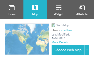
The app created by Web AppBuilder for ArcGIS is based on a web map or web scene from ArcGIS Online or Portal for ArcGIS. 2D apps are built with web maps and 3D apps are built with web scenes. A web map or web scene usually includes a basemap and operational layers that you want the users to interact with. When the Map tab is active, the thumbnail, the summary, and the owner of the web map or web scene display.
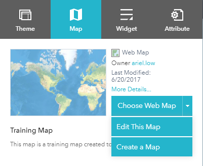
Use the Map tab to select a web map.
When you use the Map tab to select a web map for your app, the following functions are supported:
-
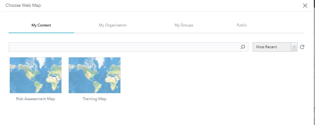
Choose a web map—Click Choose web map to open the window and choose the web map from the portal. The Choose web map windows are categorized by how they are shared.
- The My Content filter is selected by default in the portal. In addition to the specified portal, ArcGIS Online is an option for the Public web maps. Click the My Content, My Organization, My Group, or Public tabs to filter the web maps in that category. In addition, it provides sorting on the maps based on the categories of most recent, most viewed, highest rated, title, and owner.
-
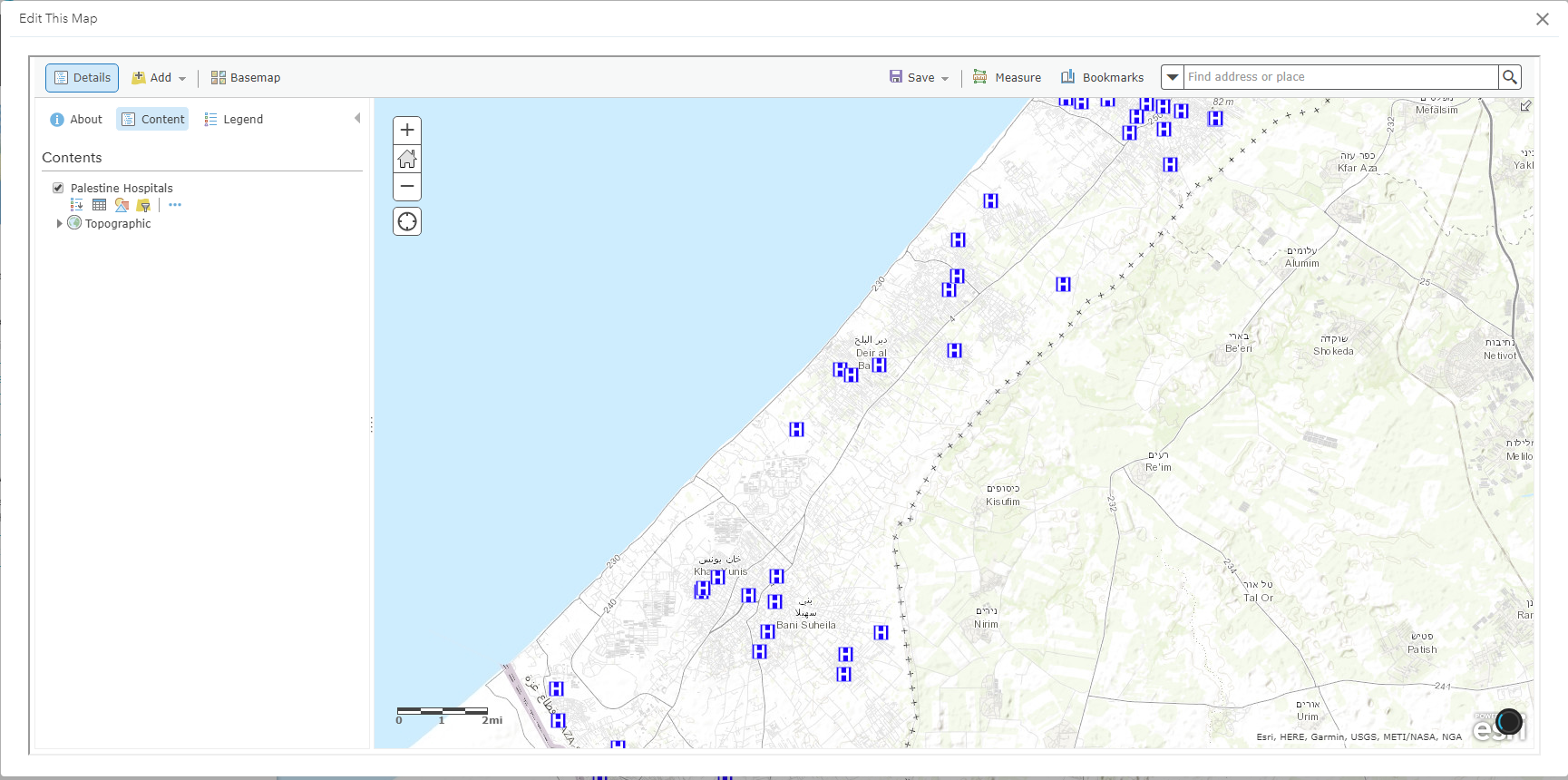
Edit the web map—Click the arrow on Choose web map to open the drop-down menu and click the Edit this map button to open the selected web map in Map Viewer. Edit the map as you normally do in Map Viewer and save it if you are the owner of the map or save it as a copy if you are not. When you close Map Viewer, the selected web map in your app is automatically updated.
-
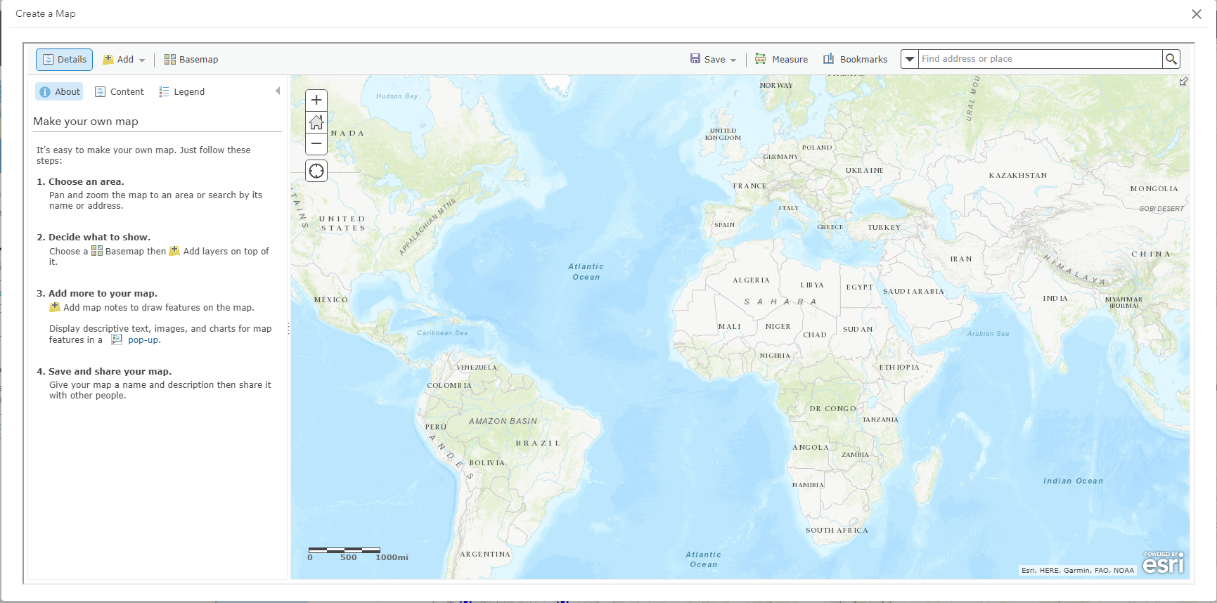
Create a new web map—Click the Create a map button on the Choose web map drop-down menu. Map Viewer opens a new map. Author the map as you normally do in Map Viewer and save it. When you close Map Viewer, your new map automatically becomes the selected web map in your app.
You can also:
-
View the details of the selected web map—Click More details right next to the map thumbnail to open the item details page for the map.
-
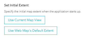
Set the initial map extent for the app—Zoom in or out to the appropriate map extent and click Use current map view, or click Use web map's default extent.
-
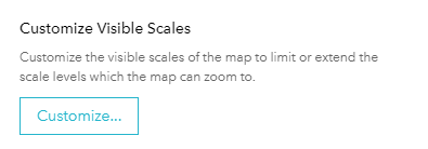
Customize map visible scales—Click Customize to open the Customize Visible Scales window, which lists all the existing scales from the map. You can delete the existing scales or add new scales to limit or extend the scale levels, which the map can zoom to.
Widget
The Widget tab allows you to configure the functionality of the app. As widgets are specifically designed to work with 2D or 3D data content, a set of widgets for 2D apps is different from 3D apps. In addition, the initial set of widgets may vary from theme to theme, as each theme has its own preconfigured set of widgets. Following are the widgets from the Foldable theme when you build 2D apps.
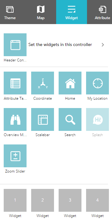
To configure a widget, hover over the widget thumbnail and click the
edit
icon  to open the widget configuration window.
[]{#_gjdgxs .anchor}
Off-panel and in-panel widgets
The preconfigured widgets may include both off-panel and in-panel
widgets.
The off-panel widgets for a theme display when the Widget tab is
activated. They can be turned on or off by the eye
icon  . The off-panel widgets that are not part
of the theme can be added to the widget controller.

The in-panel widgets can be removed or added from the widgets collection. There are two ways to add widgets from the widgets collection: by setting the controller widget or the placeholders.
Click Set the widgets in this controller to open the page for in-panel widgets.

Click + to open the widget collection that allows you to select and add widgets to the application.
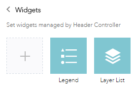
In the Choose Widget window, search for the widget or select one or more widgets. The selected widgets are highlighted in the blue boxes.

To reorder the widgets in the controller, click a widget and drag it to the location you prefer, wherever the red line appears.
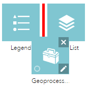
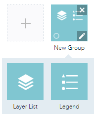
You can also group in-panel widgets by dragging one or more widgets into another widget. The grouped widget shows as a folder icon on the controller widget. To ungroup the widget, drag each widget out of the group.
On-screen widgets
On-screen widgets are those that display their icons within the map area. Usually, they include the preconfigured off-panel widgets from the theme and widgets in the placeholders.
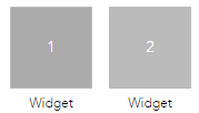
The placeholder is labeled by a number. Click it to open the widget collection window. Only one widget can be selected for a placeholder. Widgets added in the placeholders can be dragged onto the map. They also can be resized by dragging the lower right corner of the panel.
When the widget configuration completes, click Save.
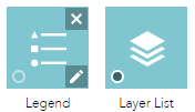
The widget added from the widgets collection can be set to open automatically when apps start. To do so, click the dot on the widget to change it to dark green. A maximum of two widgets can open automatically: one is on the controller and another in the placeholder.
Attribute
The Attribute tab allows you to perform basic customization at the app level, such as configuring your app's banner, state, and extra data sources.
Branding
You can add a logo, a title, a subtitle, and links to the banner.
-
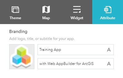
The app logo defaults to the logo defined by your organization when available. Otherwise, click the logo icon and choose Custom to open the file browser and select an image file. If you don't want to have a logo in the app, hover over the logo and click the X icon on the logo to remove it.
-
Click the A button to customize the font style for the title of the app.
-
Click the A button to customize the font style for the subtitle of the app.
-
Click Add New Link to add a hyperlink to the banner, and provide a name and valid URL.

-
To edit a link, hover over the link name and click the pencil icon. To remove a link, click the X icon. A maximum of four links can be added.

App state
Check the App state check box to keep the map extent and layer visibility when you exit the app. It is turned on by default. This option is not available when you build 3D apps.